Integrating HubSpot Forms in a Next.js + Prismic Project with Skeleton Loading

👋 Meet our tutorial partner: Backpack Works!
This tutorial is brought to you by our certified agency partner, Backpack Works. Backpack Works is a full-stack design and development agency that builds pixel-perfect corporate marketing sites, web apps, and mobile apps.
Getting Started
Integrating forms effectively is critical to the success of modern marketing websites. The form experience is arguably the most important portion of the lead generation process, and is often overlooked.
In this tutorial, we will first explore how to integrate HubSpot forms seamlessly into your Next.js and Prismic project. Then, we’ll look at the UX of form skeleton load animations and how to implement them.
So let’s get started! 👇
Get a preview of what you will be building! 👀
If you would like to see the finished project, check out the links below:
Live Demo: https://share-na2.hsforms.com/2p4oqkFu2QsSE4S_dpd2KtQ400wpy
GitHub: https://github.com/prismicio-community/hubspot-demo
What is HubSpot?
HubSpot is one of the most popular CRM platforms for small and medium-sized businesses. Adding HubSpot form embeds to a website is a key step in creating an automated sales funnel that drives qualified leads to your sales team.
Benefits of using HubSpot forms
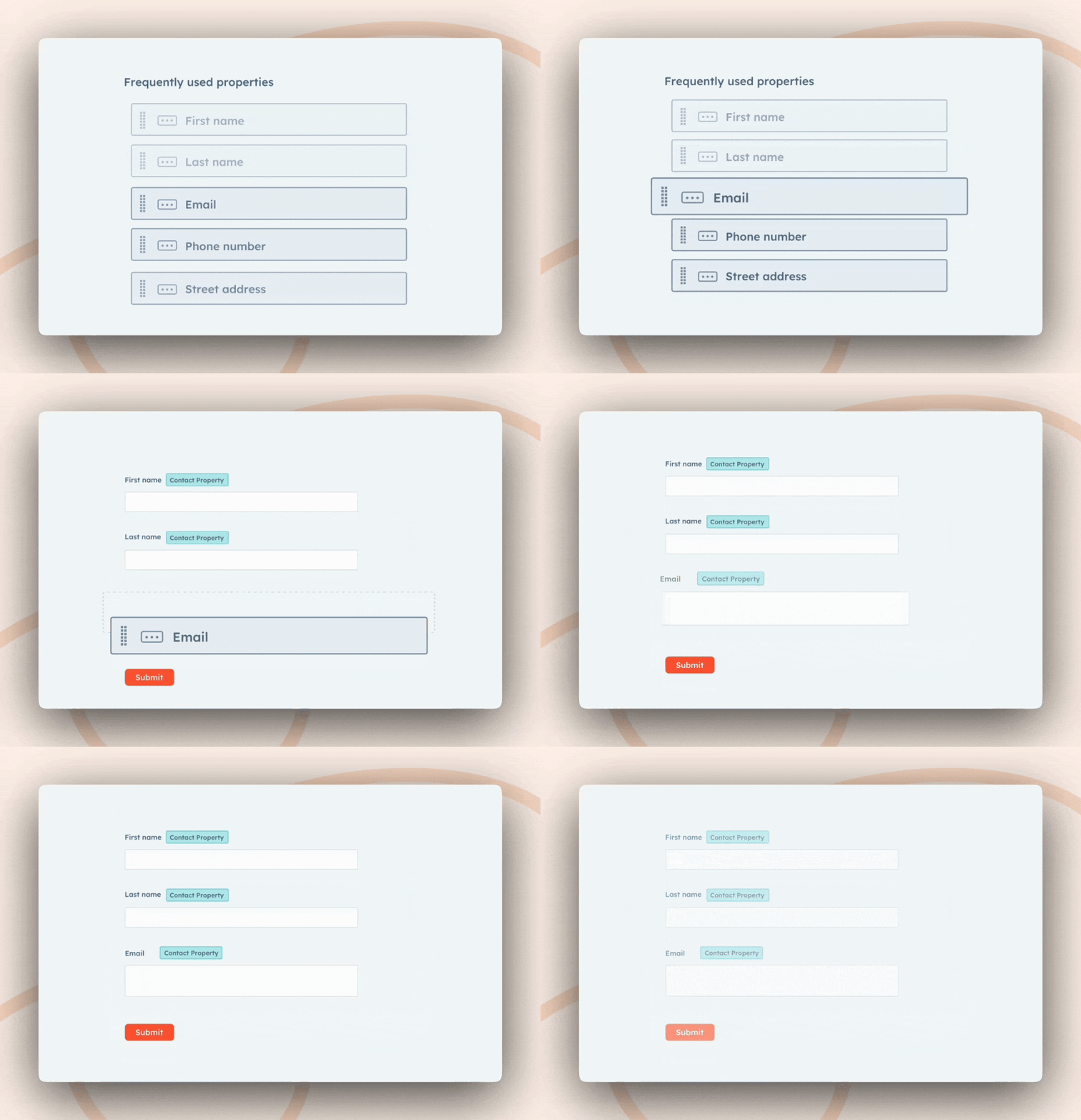
GIF from HubSpot forms page.
HubSpot forms provide a great way to capture leads on your website. The forms are easily configured in the HubSpot admin and can trigger HubSpot workflows to enable marketing functionality.
Create a HubSpot Account
You will need a HubSpot account to complete this tutorial. If you don’t already have one, create a free Hubspot account by following the steps below.
Step 1: Go to HubSpot’s Signup Page
- Open your web browser and go to HubSpot’s website.
- Click "Get HubSpot Free" or navigate to the pricing page and select the "Free CRM" option.
Setting up a HubSpot Form
After you create your free Hubspot account, follow these steps to create a new web form.
Step 1: Log into Your HubSpot Account
- Go to HubSpot’s website and log in to your account.
- From your dashboard, use the left side-menu to navigate to "Marketing > Forms."
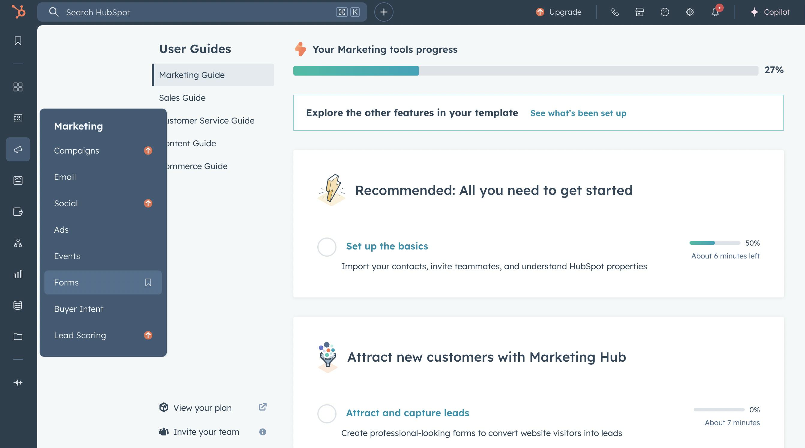
Step 2: Create a New Form
- Click the "Create form" button.
- Choose a form type: Standalone page form (hosted by HubSpot)
- Click "Next" to proceed.
Step 3: Customize Your Form
- Use the drag-and-drop editor to add fields such as Name, Email, Phone Number, or Custom Questions.
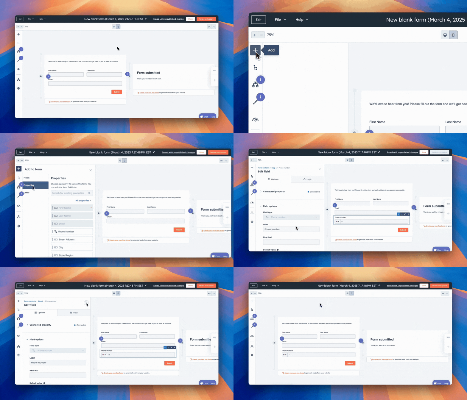
- Set required fields to ensure key information is captured.
- Customize the form title and button text (e.g., “Sign Up” or “Get in Touch”).
Step 4: Publish and Embed the Form
- Click Publish to make the form live.
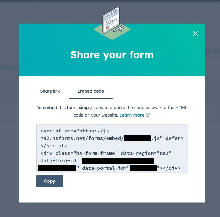
- Make a note of your Hubspot Form ID and Portal ID. The Form ID is an alphanumeric string that will be used to enter into your Prismic Slice, and looks something like this: 1234cf26-1234-4dd1-a561-9f4564e12345. The Portal ID is a numeric value.
Note: The easiest way to get both values for your form is to click "Share > Embed code", and grab the values.
How to implement HubSpot forms
Creating a composable and efficient form-creation process for your team will help reduce friction between content creators and developers. This is why we created user-friendly Prismic slices to add HubSpot forms to your Prismic projects.
Setting up our Prismic project
First, we need to create our project and repository in Prismic. Follow these steps to do so:
- Create a Prismic account or log in if you already have one.
- Under "Create a new repository", select the "Next.js" framework and then select "Connect your own web app."
- Give your project a unique name, answer the required questions, select the free plan, and click "Create repository."
You should now have a new repository created in Prismic — click "Get started," and select your primary language, which will bring you to a screen like the one below.
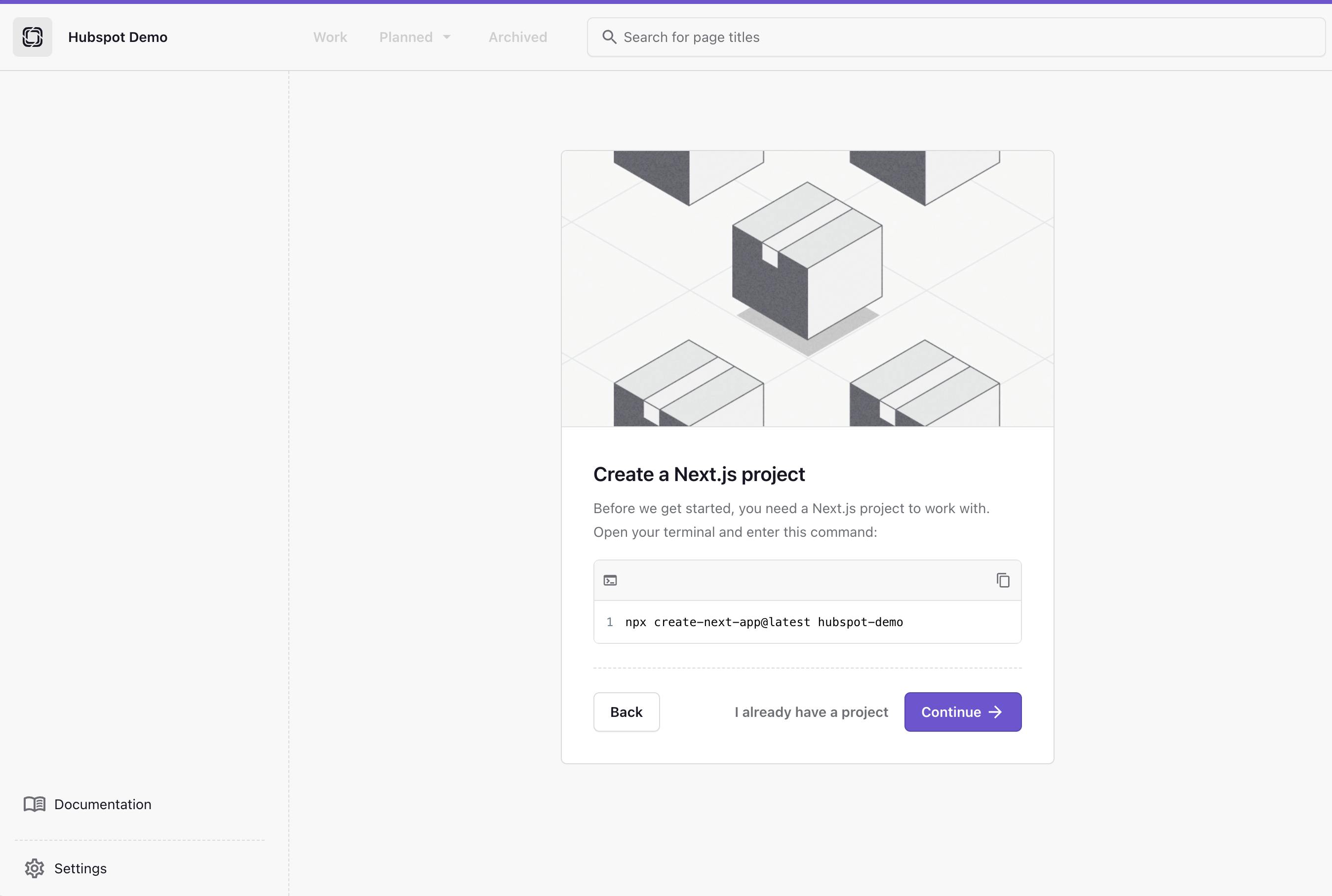
Copy the displayed command and run it locally in your terminal to set up a new Next.js app, with the following settings:
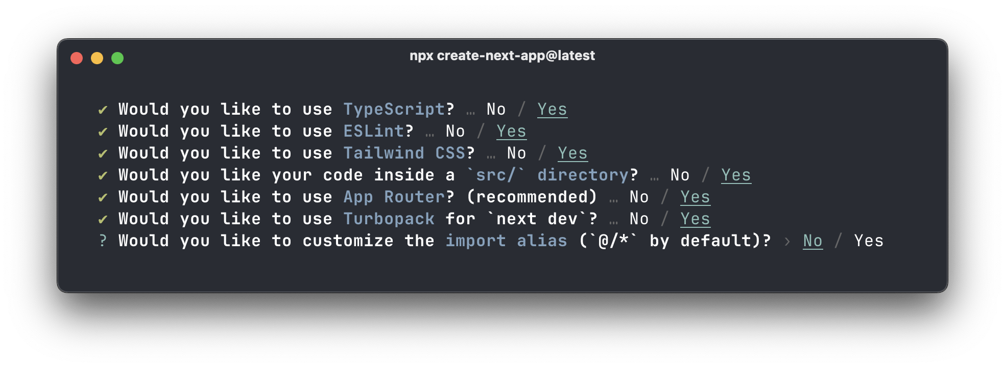
When your command is finished running, click “Continue.” Now you will see something like this:
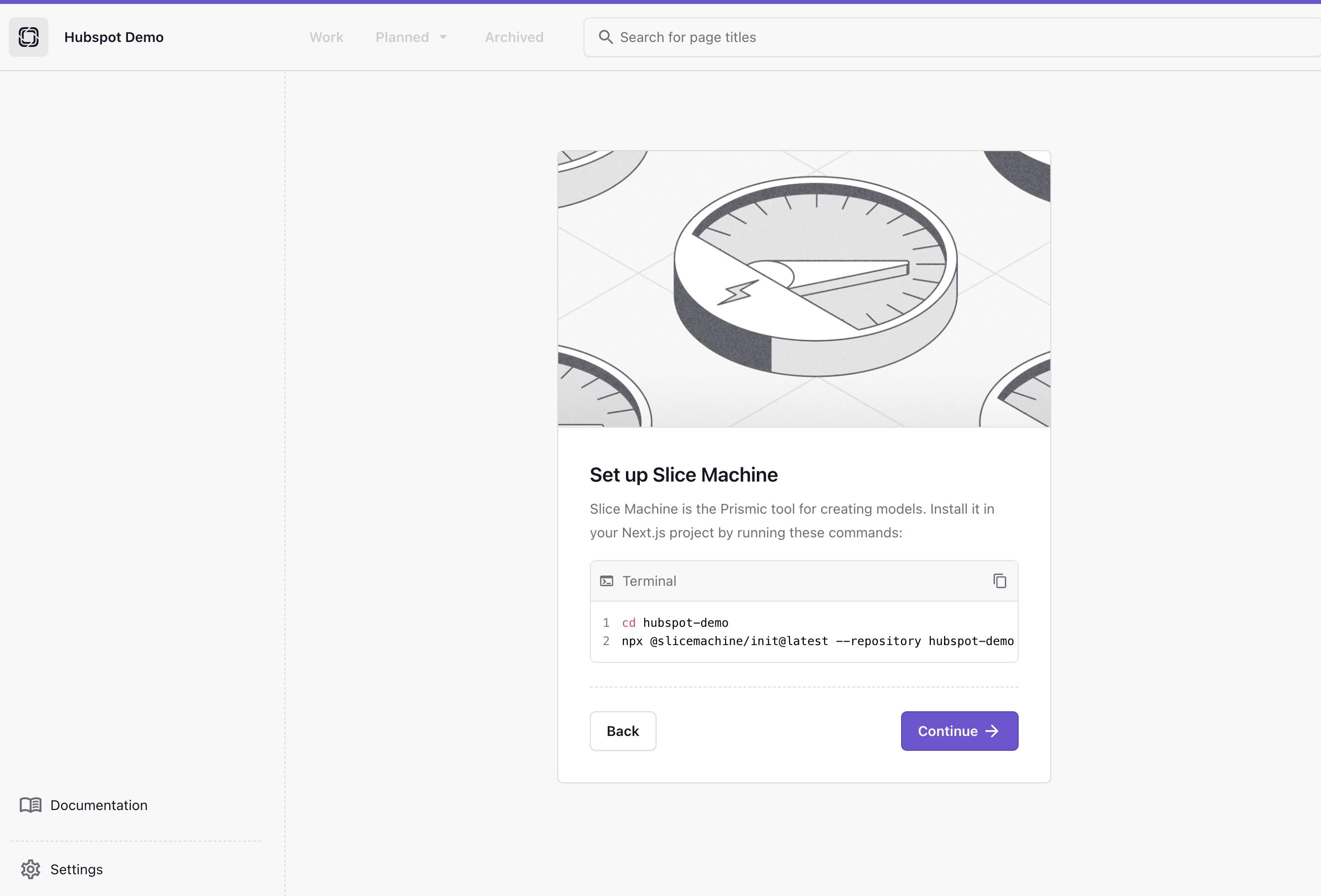
Now, in your terminal, you can cd into your project and run the command shown on screen, and then start your Next.js application locally by running npm run dev. This will start your local server on http://localhost:3000/.
In another terminal, run npm run slicemachine, which will start Slice Machine on http://localhost:9999/.
What is Slice Machine?
Slice Machine is Prismic’s developer tool that allows you to build slices, or reusable website sections, as components in your code. You can create, preview, and test slices locally without affecting your live environment. Then, you can ship the slices directly to marketers in a custom page builder so they can start using them as building blocks to create on-brand, customizable pages independently.
Now that the project is up and running, we can build out the Prismic schema to enable seamless integration of HubSpot forms in your slice library.
Set up Prismic slices schema
Open Slice Machine in your browser on http://localhost:9999/. From the menu on the left, click "Slices" and then click "Create one." Add a slice called “HubspotForm” to your slice library with the following fields:
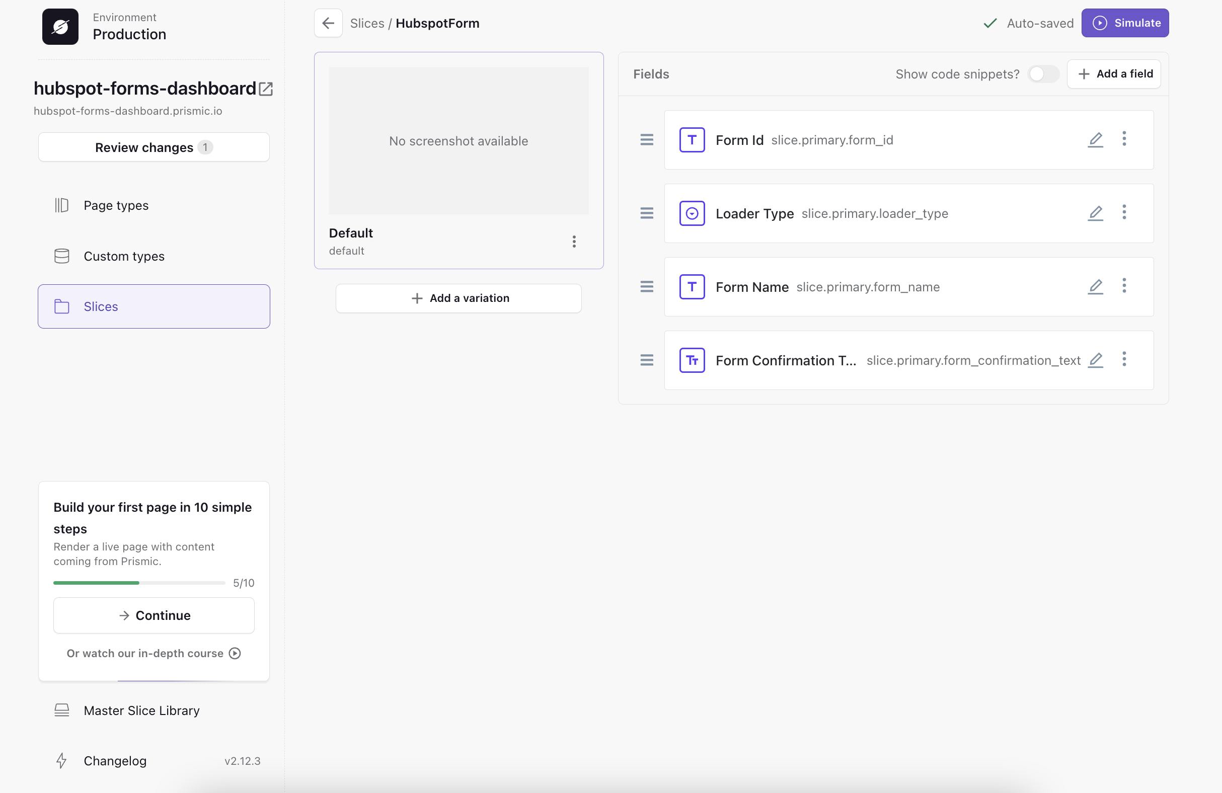
The new Schema includes the following:
- Form Id - A text field used to enter the HubSpot form ID
- Loader Type - A select field - (Make a note of this for later in this tutorial. We will show you how to apply skeleton loading animations)
- Form Name - A text field used to send GA4 Events
- Form Confirmation Text - A rich text field used to display a message after the user submits the form
Adding a page type
We also need a page type to add our new slice to. In Slice Machine, click “Page types” from the left menu, and add a new reusable type called “Page”. Then, click "Add > Reuse an existing Slice" to add a slice on this new page type, and select our newly created HubspotForm slice.
Then, in our code, replace the content in app/page.tsx with the code below, which should take care of rendering a page with UID “home” for us:
// ./src/app/page.tsx

import { Metadata } from "next";

import { SliceZone } from "@prismicio/react";

import { createClient } from "@/prismicio";
import { components } from "@/slices";

/**
 * This component renders your homepage.
 *
 * Use Next's generateMetadata function to render page metadata.
 *
 * Use the SliceZone to render the content of the page.
 */

export async function generateMetadata(): Promise<Metadata> {
  const client = createClient();
  const home = await client.getByUID("page", "home");

  return {
    title: home.data.meta_title,
    description: home.data.meta_description,
    openGraph: {
      title: home.data.meta_title || undefined,
      images: [
        {
          url: home.data.meta_image.url || "",
        },
      ],
    },
  };
}

export default async function Index() {
  /**
   * The client queries content from the Prismic API
   */
  const client = createClient();
  const home = await client.getByUID("page", "home");

  return <SliceZone slices={home.data.slices} components={components} />;
}
Pushing your models to Prismic
Then, in Slice Machine, click on the button called “Review Changes.” This should list your two changes, the new page type, and the new slice. Finally, click "Push" to push those to Prismic.
Add next-hubspot
Now that we have our schema finished, we need to install the next-hubspot npm package. This will help us embed HubSpot forms into our Next.js application using hooks. In your terminal, run:
npm install next-hubspot --legacy-peer-deps⛔ A note about next-hubspot & Next.js 15
The next-hubspot npm module is not fully compatible with Next.js 15 at this time. However, you can fix the upstream dependency issue with the —legacy-peer-deps flag when installing, as we used above. We will update this tutorial when the npm module is updated.
Add HubspotProvider
Next, we wrap our application with HubspotProvider. This adds the HubSpot script to our document and passes props to the script tag.
In our sample app, we created a Providers component in /components/Providers/index.tsx.
// ./src/components/Providers/index.tsx

"use client";

import { HubspotProvider } from "next-hubspot";

export function Providers({ children }: { children: React.ReactNode }) {
  return <HubspotProvider>{children}</HubspotProvider>;
}
Then, in /app/layout.tsx we need to wrap our app with the <Providers> component and import it at the top of the file:
// ./src/app/layout.tsx

import type { Metadata } from "next";
import { Geist, Geist_Mono } from "next/font/google";
import "./globals.css";
import { Providers } from "@/components/Providers";

const geistSans = Geist({
  variable: "--font-geist-sans",
  subsets: ["latin"],
});

const geistMono = Geist_Mono({
  variable: "--font-geist-mono",
  subsets: ["latin"],
});

export const metadata: Metadata = {
  title: "Create Next App",
  description: "Generated by create next app",
};

export default function RootLayout({
  children,
}: Readonly<{
  children: React.ReactNode;
}>) {
  return (
    <html lang="en">
      <body
        className={`${geistSans.variable} ${geistMono.variable} antialiased`}
      >
        <Providers>{children}</Providers>
      </body>
    </html>
  );
}
Deliver a fast website with a visual page builder!
Prismic is a headless solution with a visual page builder for your marketing team to release pages independently.
Create HubspotForm component
Finally, we can create a new component in our slice library under /slices/HubspotForm/index.tsx. We define our HubSpot form by entering three variables.
- portalID - our HubSpot portal ID
- formID - our HubSpot form ID
- target: the form wrapper
<div>
// ./src/slices/HubspotForm/index.tsx

"use client";

import { FC, useEffect, useState } from "react";
import { Content, asText } from "@prismicio/client";
import { SliceComponentProps } from "@prismicio/react";
import { useHubspotForm } from "next-hubspot";

/**
 * Props for `HubspotForm`.
 */
export type HubspotFormProps = SliceComponentProps<Content.HubspotFormSlice>;

/**
 * Component for "HubspotForm" Slices.
 */
const HubspotForm: FC<HubspotFormProps> = ({ slice }) => {
  const [showForm, setShowForm] = useState(false);
  const { loaded, error, formCreated } = useHubspotForm({
    portalId: process.env.NEXT_PUBLIC_HUBSPOT_PORTAL_ID || "",
    formId: slice.primary.form_id || "",
    target: "#hubspot-form-wrapper",
    inlineMessage: asText(slice.primary.form_confirmation_text)
  });

  useEffect(() => {
    if (formCreated && loaded) {
      const timer = setTimeout(() => {
        setShowForm(true);
      }, 2000); // 2 second delay for demo purposes

      return () => clearTimeout(timer);
    }
  }, [formCreated, loaded]);

  if (error) {
    console.log(error);
  }

  return (
    <section
      data-slice-type={slice.slice_type}
      data-slice-variation={slice.variation}
    >
      <div className="mx-auto max-w-2xl p-12">
        <div
          id="hubspot-form-wrapper"
          style={{ display: showForm ? "block" : "none" }}
        />
      </div>
    </section>
  );
};

export default HubspotForm;
In the code above, you'll see that we used a .env variable for the portalId as a best practice. This is a very easy step that you can implement to improve the security of your forms. For more information, head over to Vercel’s documentation: https://vercel.com/docs/projects/environment-variables. In short, you can add a .env file at the base level of your app and add the following code (swapping in your portal ID):
NEXT_PUBLIC_HUBSPOT_PORTAL_ID=INSERT_YOUR_PORTAL_IDAt this point, you should have a working HubSpot form component that is flexible and easy to implement in Prismic slices.
Now, we are going to look at the UX of form skeleton load animations, and how implementing them can improve cumulative layout shift in your Next.js and Prismic application!
Benefits of skeleton loading animations
Better perceived load time
When implementing 3rd-party form embeds, we must wait for the network request to complete and fully deliver the form. Since we often cannot control this, we can create the perception of improved load time with skeleton load animations.
Improve cumulative layout shift
Cumulative layout shift is an important metric that Google Lighthouse scores are impacted by. It measures the visible stability of the web page’s content as a user views it. When 3rd-party forms are loaded, they often load after other content on the page. This makes a poor user experience and negatively affects CLS scores. To fix this, we can use the skeleton UI elements as placeholders while the actual form loads in the background.
5 strategies and tools for minimizing cumulative layout shift!
To learn more, check out this dedicated article for effective ways to minimize cumulative layout shift.
Increase form conversion rate
Improving the form experience on any website is critical to the overall conversion rate. By adding improvements like skeleton load animations to our forms, we are delivering a better user experience that will lead to less form drop-off and high conversion rates.
Creating the Skeleton component
Next, we are going to create a flexible loading animation component that will serve as a placeholder for the form input fields.
We have the flexibility to select multiple loader types depending on what the admin user in Prismic selects. This allows us to create one component that has multiple form layouts.
Head over to /components/ and define your Skeleton animations in /components/Skeleton/index.tsx. In our case, we added a switch statement to allow the Prismic admin user to select which loader type is used. This allows you to easily set up Prismic form Slices and implement the appropriate loading animation.
// ./src/components/Skeleton/index.tsx

import { FC } from "react";
import { Content } from "@prismicio/client";

type TSkeleton = {
  type: Content.HubspotFormSlice["primary"]["loader_type"];
};

function FieldSkeleton({
  type = "input",
  lableWidth = 70,
}: {
  lableWidth?: number;
  type?: "input" | "textarea" | "button";
}) {
  return (
    <div className="flex flex-col gap-1 w-full">
      <div
        className="h-5 rounded-md animate-skeleton bg-gray-200"
        style={{
          width: lableWidth + "px",
          display: type === "button" ? "none" : "block",
        }}
      />
      <div
        className="w-full rounded-md animate-skeleton bg-gray-200"
        style={{
          height:
            type === "textarea" ? "66px" : type === "button" ? "38px" : "40px",
          marginTop: type === "button" ? "18px" : "0",
          width: type === "button" ? "90px" : "100%",
        }}
      />
    </div>
  );
}

const Skeleton: FC<TSkeleton> = ({ type }) => {
  switch (!!type) {
    case type === "1":
      return (
        <div className="flex flex-col items-start gap-[18px] w-full">
          <FieldSkeleton lableWidth={40} />
          <FieldSkeleton lableWidth={140} />
          <FieldSkeleton lableWidth={60} />
          <FieldSkeleton lableWidth={60} />
          <FieldSkeleton lableWidth={45} />
          <FieldSkeleton type="textarea" lableWidth={55} />
          <FieldSkeleton type="button" />
        </div>
      );
    case type === "2":
      return (
        <div className="flex flex-col items-start gap-[18px] w-full">
          <FieldSkeleton lableWidth={40} />
          <FieldSkeleton lableWidth={140} />
          <FieldSkeleton type="textarea" lableWidth={55} />
          <FieldSkeleton type="button" />
        </div>
      );
    default:
      return null;
  }
};

export default Skeleton;
Then we need to make our HubspotForm slice use this skeleton by importing it at the top, and then conditionally adding it to show when the form is not loaded, head back to your /slices/HubspotForm/index.tsx and add:
// ./src/slices/HubspotForm/index.tsx

// Add this below all you other imports
import Skeleton from "@/components/Skeleton";

// Add this after the #hubspot-form-wrapper div
{!showForm && <Skeleton type={slice.primary.loader_type} />}
As you can see in the Skeleton component, we have two different loaded types, customized for two different forms with different fields. You can add more loader types here to cater to all of your HubSpot forms.
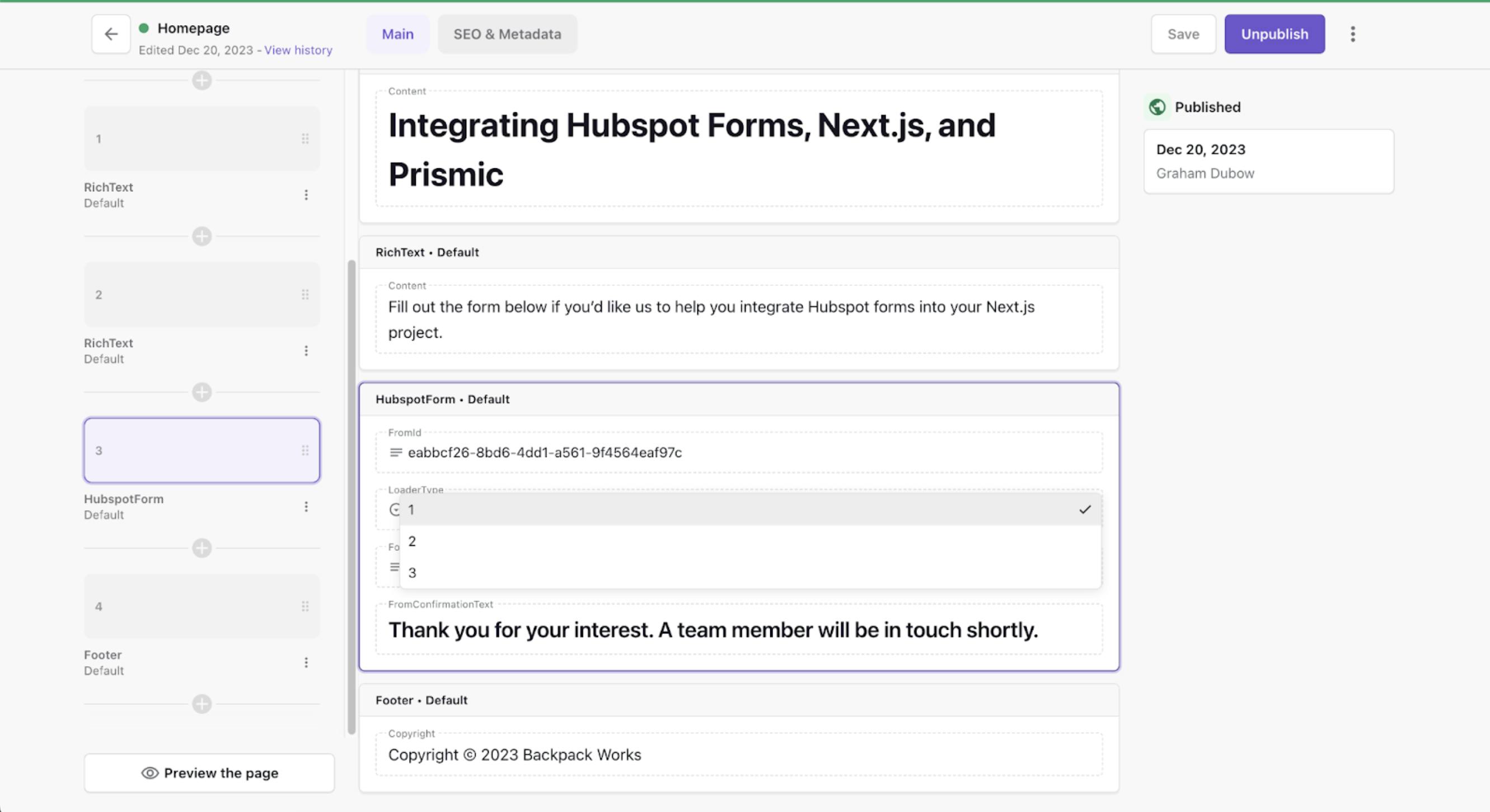
We can then add multiple options for LoaderType in our Prismic schema, as seen in the screenshot below.
Testing our new form slice
Since we now have all the code available to render our slice, let’s test it out. Navigate to your Prismic dashboard (you can get there directly by going to https://your-repo-name.prismic.io/builder/ and swapping in your repo name).
Click “Create a new page” to add a page, and add our new slice to it, and fill out the fields (make sure to give the page a UID of "home").
Note— you might be prompted to configure a live preview, which allows you to see real-time changes in the Page Builder. For this tutorial, you can follow the steps to set it up, or skip— whichever you prefer.
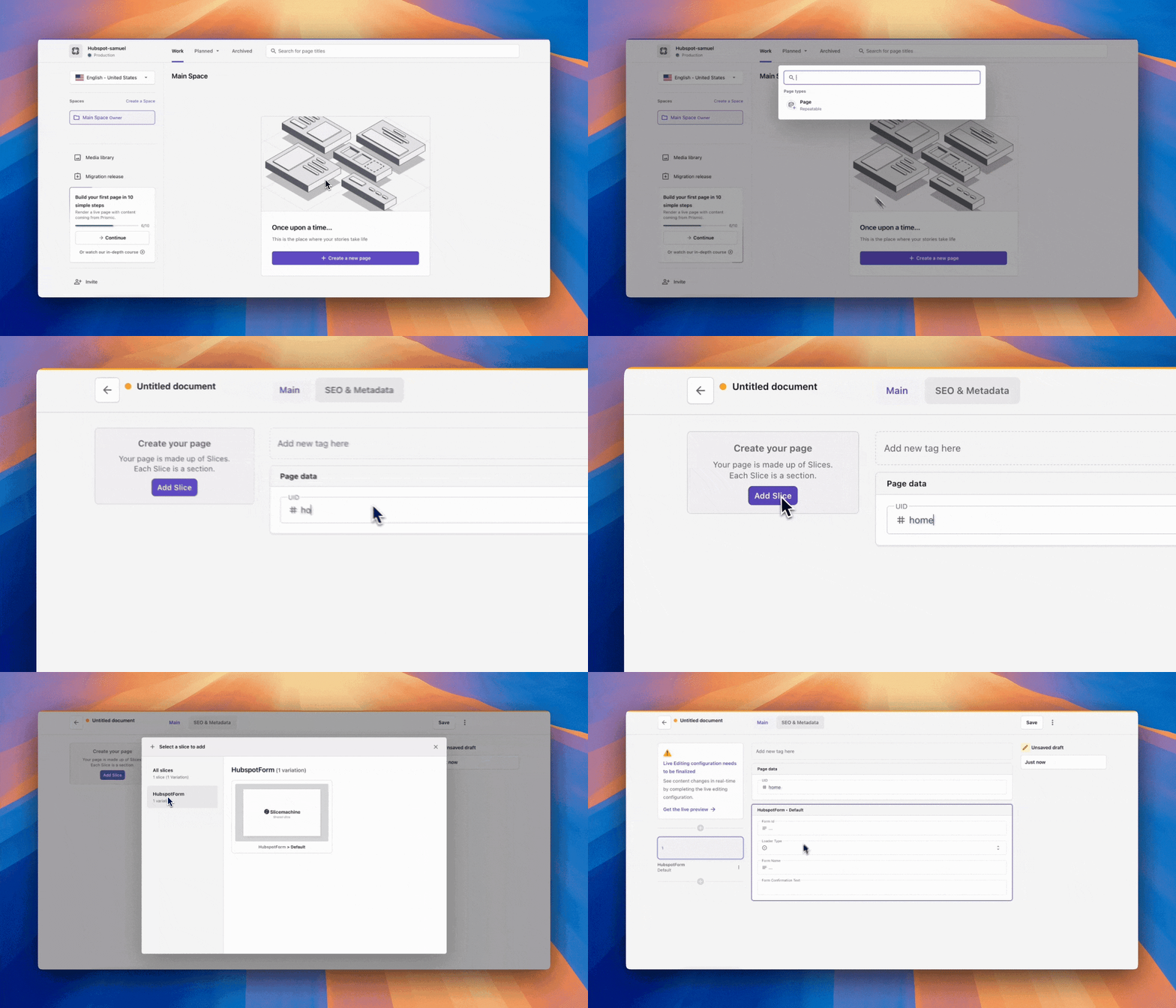
Finally, click "Save > Publish", and you should have something looking like this:
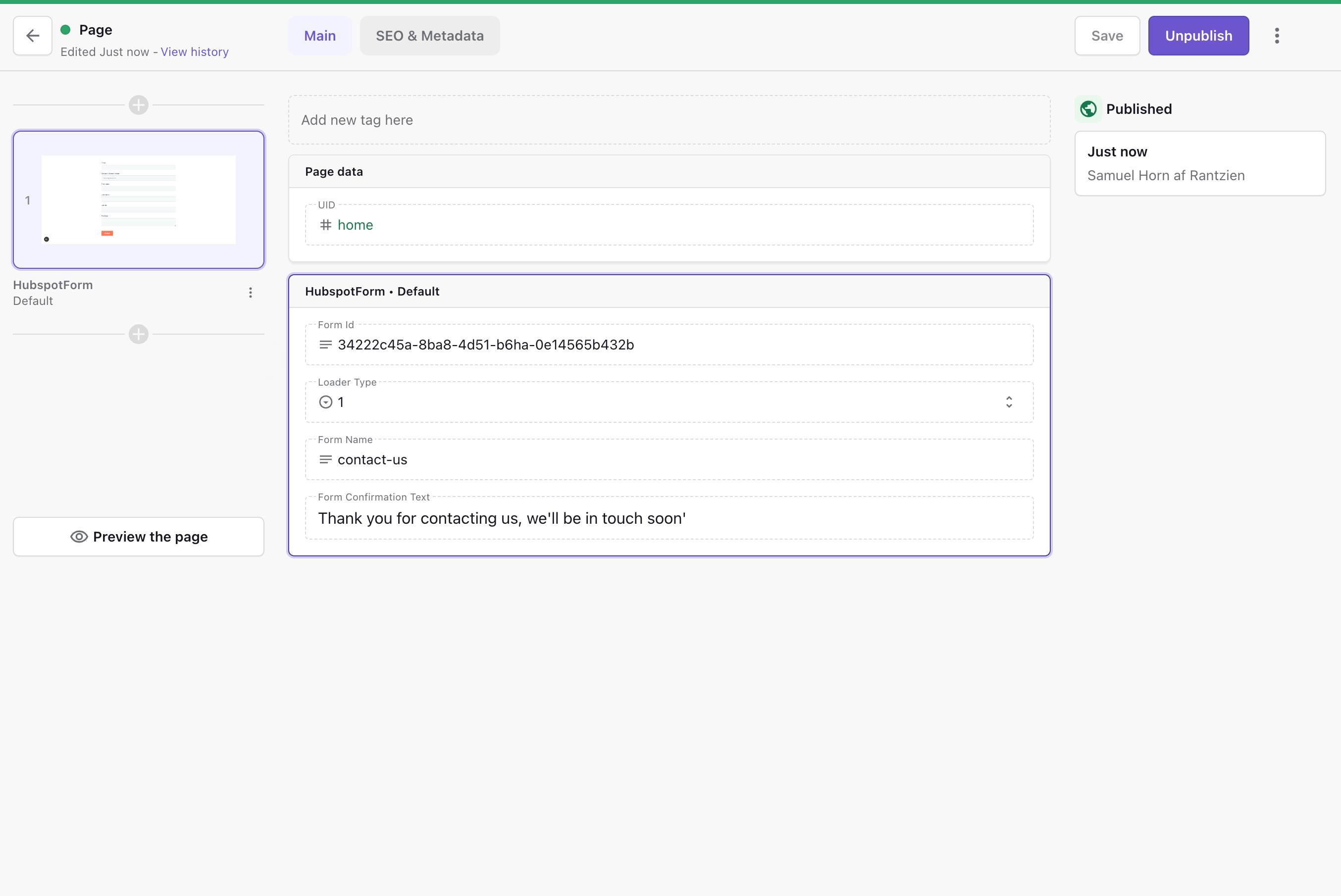
With that page published, if you now refresh your Next.js app at http://localhost:3000, you should see our new form slice.
You should also see our skeleton pulsing before the form gets loaded, efficiently preventing all possible layout shifts for future content further down the page.
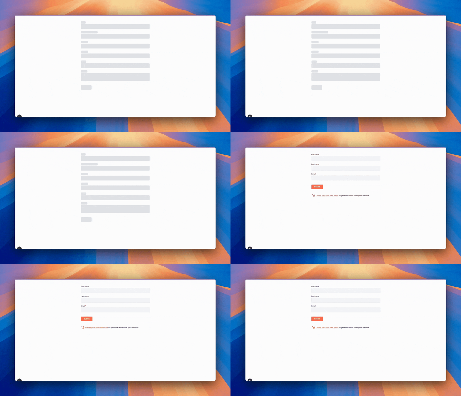
As you might have noticed, it takes a while for the form to load. This is because we added an artificial delay at lines 27-29 in the HubspotForm slice:
...
const timer = setTimeout(() => {
    setShowForm(true);
}, 2000); // 2 second delay for demo purposes
....
This delay was added to demonstrate how the Skeleton component works. We can now remove it by keeping the setShowForm(true) and removing the setTimeout function around it.
Now, with that removed, the form should load pretty much instantly, but if HubSpot has slow response times for some reason, we will have this skeleton in place until the form is loaded.
Conclusion
In this tutorial, we've covered how to implement HubSpot forms in a Next.js and Prismic project, focusing on both functionality and user experience. We've learned how to:
- Set up a Next.js + Prismic project
- Create a flexible HubSpot form slice in Prismic
- Implement the HubSpot form component with proper security practices
- Add skeleton loading animations to improve perceived performance and reduce layout shift
This implementation not only makes form management easier for content teams but also delivers a better user experience through smooth loading states and stable layouts.
We hope you have enjoyed this tutorial on how to implement Hubspot forms using Next.js and Prismic!
If you need help or have any questions, feel free to get in touch with us at hello@backpack.works.


